Why a Limited Palette Can Make a Film World Feel Whole
A limited color palette can make a film world feel whole by guiding the eye across scenes and showing when a deliberate color shift changes the mood.
The common mistake in a film palette is to treat every scene as a fresh chance to add another striking color. The result can be a world that feels assembled from unrelated images, with no visual thread for the viewer to follow. A limited color palette gives a film a way to guide the eye across locations, costumes, and objects without making them look identical.
What does a limited color palette do on screen?
A palette is not simply a list of colors used on screen. It is a set of relationships: which hues dominate, which tend to appear together, and which are held back. A film might lean on dusty green, cream, and dark brown, for instance, while allowing a sharp red to draw attention at a carefully chosen moment.
That organization can help viewers distinguish visual information. A recurring color may signal a familiar place or object; a color that appears only briefly can register as a change. These effects do not require viewers to consciously name the palette. They depend on what the image has made familiar and what it asks the eye to notice now.
How can a palette help viewers read a scene?
Color can clarify what deserves attention before a character speaks or moves. A prop that contrasts with its surroundings may become easier to spot, while a costume close in color to a wall can make its wearer seem less distinct from the room. Framing, lighting, and movement still matter, but palette decisions affect how quickly those elements separate in the image.
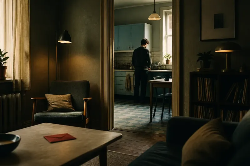
Imagine a fictional mystery that uses charcoal, faded blue, and cream in an apartment. A small red envelope appears on a cream table, and the camera holds the frame without adding other bright objects. The expected result is that the envelope becomes easy to notice, though the color alone does not tell viewers what it means.
This distinction matters: a color can direct attention without serving as a code. A filmmaker may use contrast for clarity, unease, or a shift in emphasis, then let performance and story provide the rest of the meaning.
How can color shifts mark a change in tone?
A film need not keep its palette fixed. It can become warmer, cooler, or more saturated as the story changes, while retaining a few visual relationships that help viewers recognize the shift as part of the same film. A familiar hue might move from a background surface to a costume, or a once-muted color might occupy more of the frame.
Say a fictional drama begins with pale blue appearing only in kitchen tiles and window light. Later, its protagonist enters a crowded station, where blue becomes more prominent in signs and clothing. The expected effect is a noticeable change in the scene’s visual emphasis, while the returning hue links it to the earlier setting.
Such a shift need not carry a single, fixed meaning. Viewers may read the change as emotional, practical, or simply atmospheric, depending on the surrounding images and the story’s context.
How do surface and lighting affect color?
The same hue can look different on glossy ceramic, faded cotton, painted wood, or skin. Light alters those impressions as well: a color under warm practical lamps may not resemble its appearance beneath cool daylight. This is why a palette cannot be judged only by a row of swatches detached from materials and scenes.
For planning, a small digital palette in a tool such as Adobe Photoshop can help establish relationships, while physical fabric and paint samples show how materials respond to actual light. A frame reference board can hold stills, swatches, and notes about the intended source of light. These references clarify a direction; they do not replace checking how colors sit together in a finished composition.
What should a production team check before a scene?
A useful review ties each observation to a decision, rather than treating palette notes as rules that every department must follow mechanically.
- Check the dominant hues in the frame. If they support the scene’s intended emphasis, keep the arrangement; if they compete, simplify a background surface or adjust a costume color.
- Check whether the focal prop separates from its surroundings. If it is easy to locate, retain the contrast; if it blends in, change its placement, surrounding color, or lighting.
- Check where recurring colors appear. If a return helps connect a place or moment, preserve it; if it feels arbitrary, remove it or give it a clearer visual role.
- Check how materials alter a chosen hue. If fabric, paint, and prop surfaces read as related, keep their differences; if they clash unintentionally, change a material or revise the reference.
- Check for competing bright accents. If one accent remains easy to notice, leave the others; if several demand attention at once, quiet or relocate the less important ones.
- Check how the palette changes from the previous scene. If the shift supports the intended transition, retain it; if it feels abrupt without purpose, bring back a familiar hue or soften the change.
Imagine a fictional short film preparing a hallway scene with a slate-blue coat, ochre wall paint, and a vivid green exit sign. The director wants viewers to notice the coat first, but the sign draws the eye. The team keeps the coat and wall, moves the actor away from the sign, and frames the sign less prominently; the expected result is a clearer distinction between the character and the safety marker, though the sign remains visible.
What questions come up about limited color palettes?
Does a limited color palette mean using only a few colors?
No. It means a small set of relationships dominates, while other hues can appear in controlled ways. Differences in shade, brightness, and material can create variety without making the image feel scattered.
Can bright colors still belong in a cohesive film palette?
Yes. A bright color can fit when it supports the composition or returns in a recognizable pattern. The question is not whether it is subdued, but whether its presence has a clear visual purpose.
Why can repeated colors feel heavy-handed?
Repetition can feel mechanical when the same hue appears at the same scale and in the same position. Varying its surface, placement, or prominence can preserve recognition without making the pattern look stamped onto every scene.
Does a contrasting color always signal a plot clue?
No. Contrast may guide attention or alter the mood without encoding a literal message. The surrounding image and story determine how viewers interpret it.
How can a film avoid making its palette feel forced?
A designed palette can feel imposed if every object appears selected to repeat the same scheme. Realistic settings contain incidental colors, and those deviations may make a scene feel more credible. The useful choice is whether a stray hue enriches the image or distracts from its intended focus.
For anyone examining a limited color palette in film, notice what the color helps you see: a prop, a character’s relationship to a place, or a change in tone. Then compare that effect with the materials and light around it. The palette is working when it guides attention without requiring every detail to match.